CPHUX
Denmark's largest UX Community
Business Case

CPHUX is a Copenhagen based startup working to raise industry standards of UX design by uniting UX designers and businesses.

The Challenge

CPHUX was in its startup phase. They needed a website and an application where people could sign up and pay – and the quicker the better. Payments would be used to further develop the product.

Project Scope & Objectives

There were a variety of things that would be needed to bring in paying members:

» A fully responsive website delivered in code. It was imperative to work for both desktop and mobile devices.

» A sign-up flow to guide the user in joining, paying, and registering as a new user.

» An HTML and Django template needed to be created in order to create new pages for the website when needed.

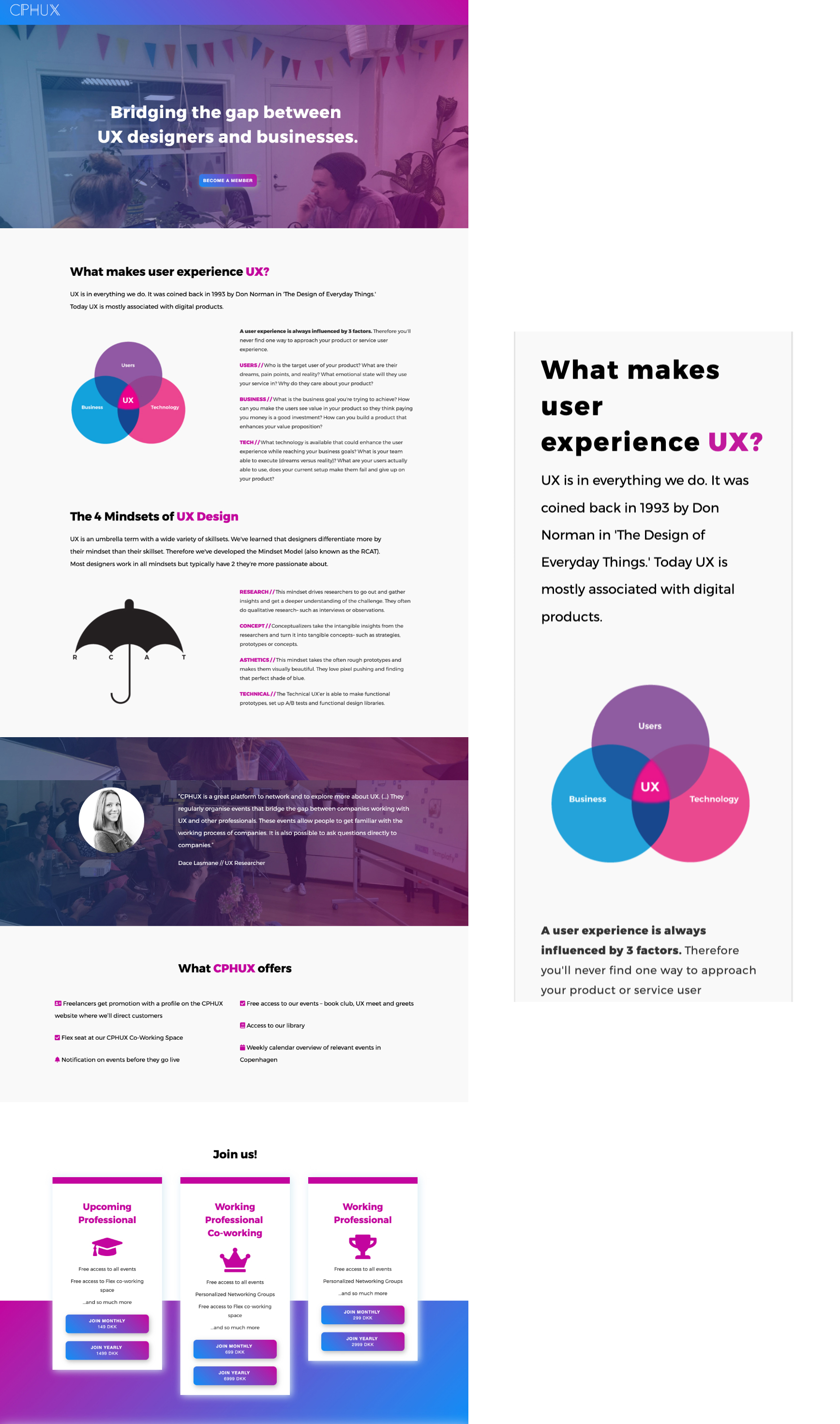
» A style guide needed to be created to keep all added features consistent.

desktop and mobile screens
Live first version of website built with HTML, CSS and Django. It was built using a grid system to make it easy to navigate desktop and mobile screens.
The Solution

✓ Style guide created in code to keep new iterations consistent

✓ A product where a user could sign up, pay and find out about the organization

✓ Modular design & code for easy adoption of new pages and components

✓ Product optimized to work on mobile and desktop screens

The Team

Founder & Community Lead Helena Levison

Backend Developer Krisjanis Vaiders

Frontend Designer & Coder Marci Papineau Gottlieb

Digital Designer Zsanett Vigh

My Role

I Wrote all HTML and CSS. Upon hand over of design from UX Designer, made design adjustments that helped make the content more concise and easy to code. Tightened designs during coding. I collaborated with the backend developer closely. We worked in Python and Django. I helped create new pages in the Django framework. Collaboration via Slack and Github.

Skills Utilized

» UI Design
» Rapid Prototyping
» Product Development
» Responsive / Mobile First Design & Code
» Coding and designing directly in the browser

Tech Used

» HTML & CSS » Git » Django » Python » Visual Studio Code » Bootstrap » Google Fonts

Stages of creation
Left to right: Initial concept and layout made in Illustrator, secondly transferred to code– where more decisions were made about typography and colors, and finally how it's working on mobile.

The Process

Step 1 Dialog with backend developer who would build the backend in Django. In order to work on the frontend design/code, I setup in a Django / Python environment to run a local server for development.

Step 2 Set up the project in Git for collaboration.

Step 3 Discussion of what was most important in the first iteration.

Step 4 Started to code screens from rough designs. Made design decisions based on how to make it optimal on all types of screens. Finessing the UI at this time.

Step 5 Worked with Atomic design principles.

Step 6 Coded reusable CSS for future development

Step 7 Deployed via Heroku

Step 8 User testing on the sign-up process (highlighted some problematic spots that needed revisions).

Step 9 Added more detail to the landing page, and subsequent pages

Working with gradients directly with the code
This made it easy to tryout out global styling directly on the website, and made development move quickly. In this picture for example, I could try different gradients on multiple photos without ever needing to open Photoshop.

Rationale for Design and Code Solutions

Modular Design The design was thought of in modular blocks to make it work on various screen sizes.

Mobile First Code One of the most important criteria was that it worked on a phone, as that is where their users are. Because of the short deadline, Bootstrap was used for their responsive grid "right out of the box."